Article / NY Islander

NY ISLANDER
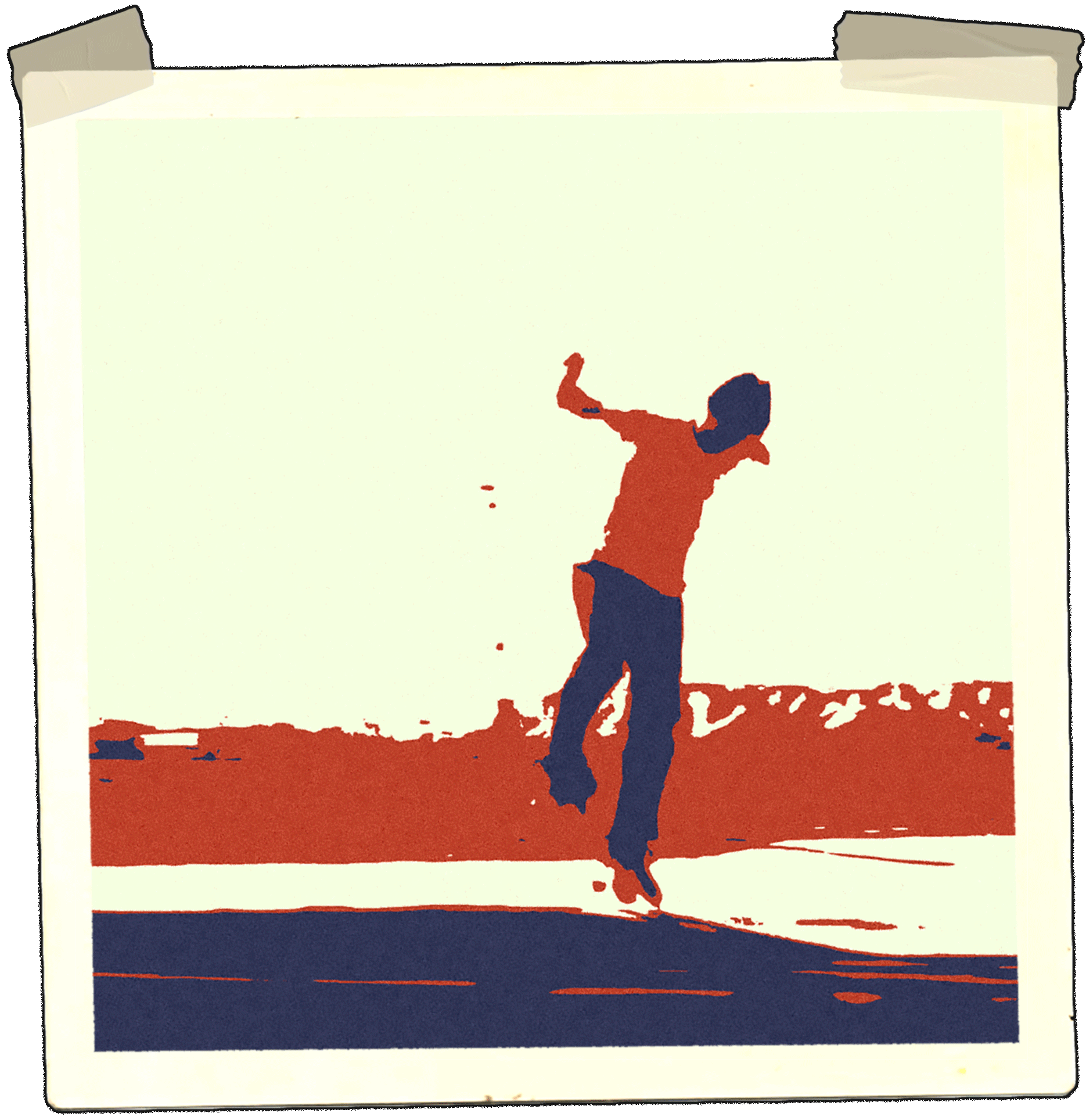
Then-and-now teenage brains are highjacked by skateboarding.
In late 70s southern California a culmination of draught and teenage boredom incomprehensibly formed the bedrock for skateboarding as we know it. A gritty mixture of creativity and resourcefulness were also crucial ingredients to its sedimentary foundation.
Our neighborhood landscapes and urban sprawl were reimagined as runways to obstacles. The culture and symbols to many of the iconic skateboard brand logos and graphics were also re-imaginings of already iconic fixtures in popular consumer culture.
Skateboarding’s unapologetic “borrowing”, parody as it’s called; wasn’t exactly new though. Artists of the 50’-80’s pop era were the pioneers to novel use of persuasive visual communication methods that had been perfected by advertisers, cartoonists and celebrity culture. The high art world had effectively co-opted the overwhelming distractions of corporate advertisements and claimed it as fair use.
Some of the best examples of parody require little to no alteration at all. Think, “Fucked-up-blind-kids” Garbage Pale Kids spoof, which was a spoof of a spoof; or 101’s Green lantern logo tilt, or Bjork photographed in an “Enjoy Cock” t-shirt in the early 90s.
A purposefully branded symbol taken ironically and subtly tweaked to effectively hijack its meaning.
In the early 90s Gino Iannuci was one of the most celebrated names in street skateboarding. Throughout his career, brands and products bearing his name have produced some of the most iconic graphics to date. Many of them blatantly-blatant examples of parody.
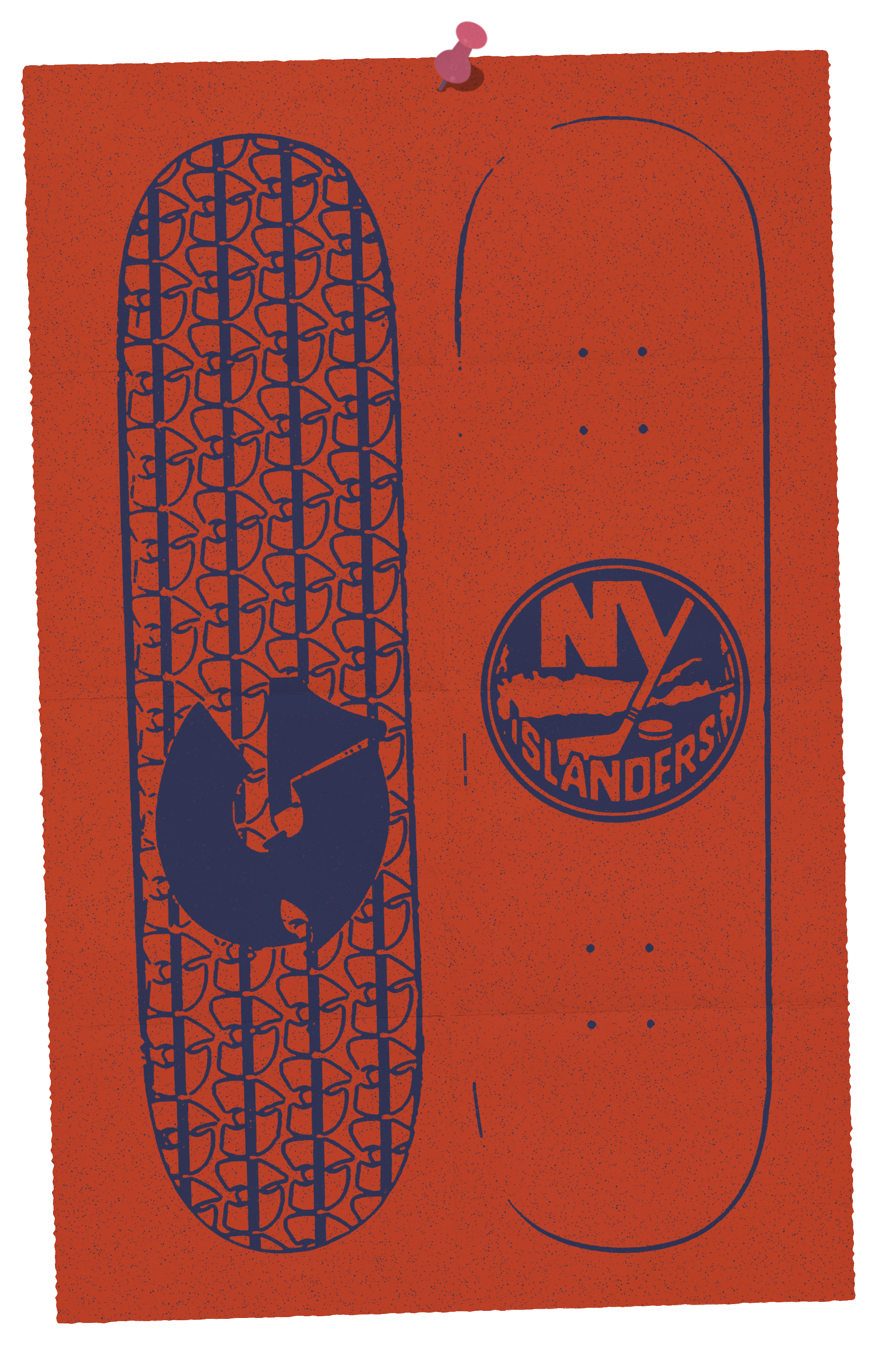
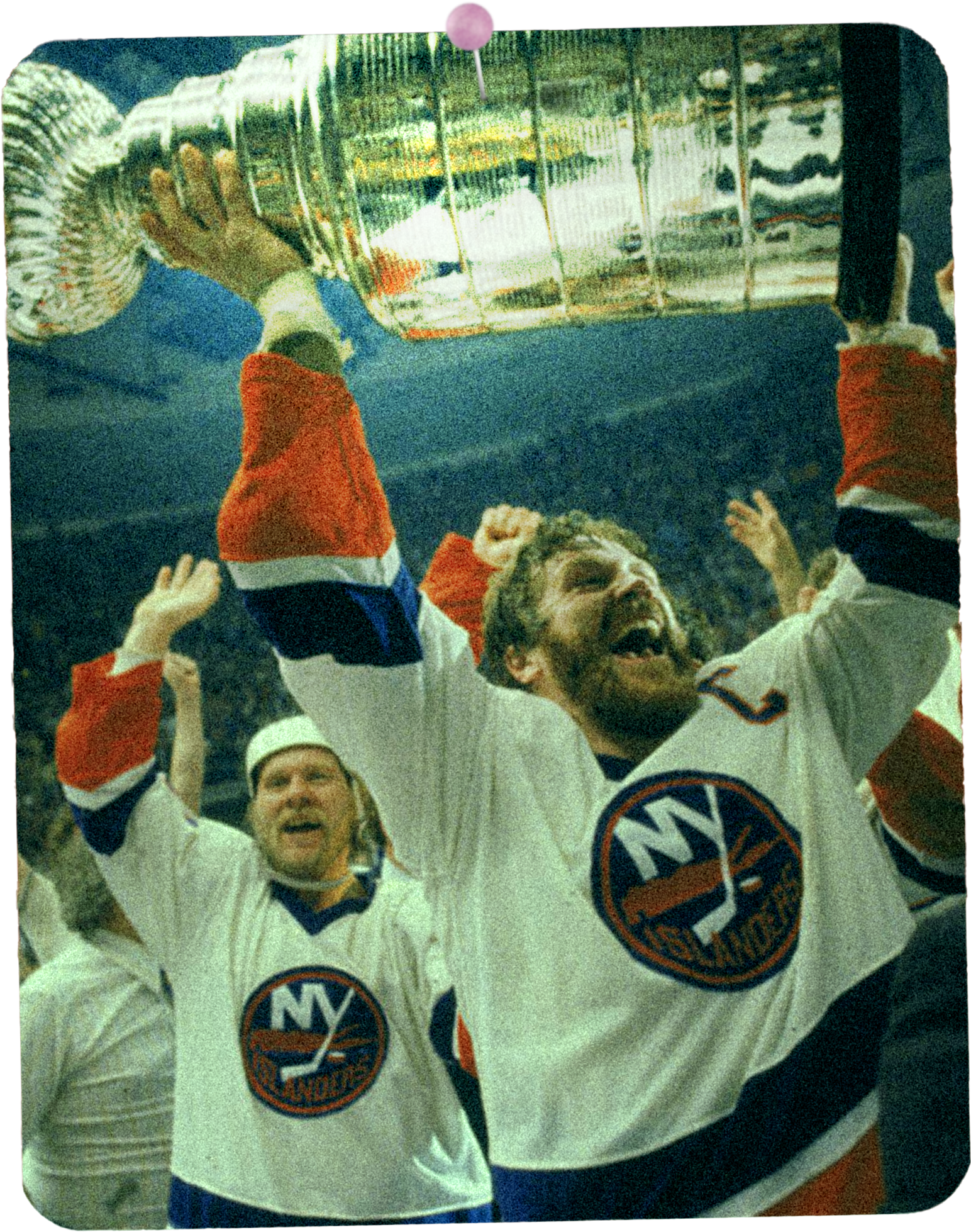
As a Long Island native, Gino was born and raised a trains ride from the center of the Western world. One of his most iconic graphics signified local pride and allegiance while to your average sports fan it was the symbol to a floundering NHL team that hadn’t seen success since a decade prior.
To myself along with probably many outside the north eastern region of the United States, we only vaguely knew of it. It held no lasting meaning. What was a professional hockey team logo belonging to the New York Islanders was in turn now a unique graphic that meant GINO IANNUCCI, and nothing else.
Parody is hardly a unique angle in today’s media landscape. Still though whenever I catch a glance at sports news and see an NHL scoreboard, if I read NY Islanders the intended purpose is secondary. The symbol and the perceptions of our teenage brains HIGHJACKED!